
Glimmer
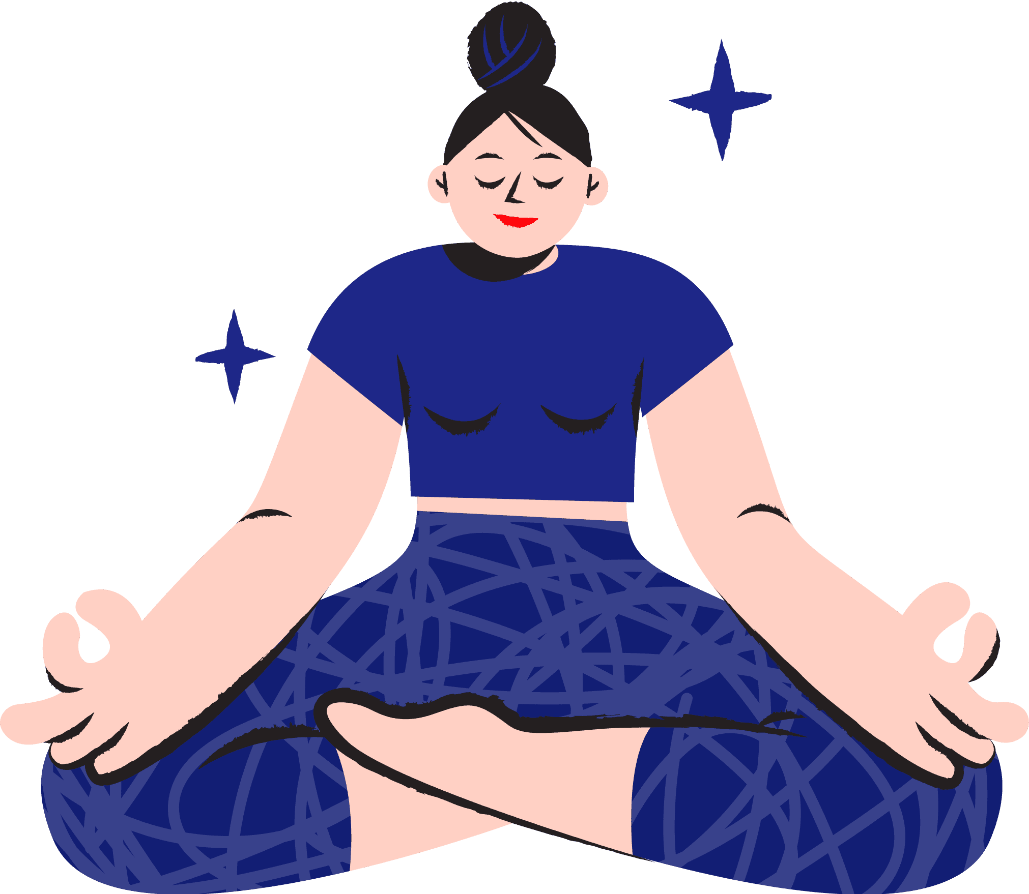
Your All-In-One App for Meditation & Wellbeing
INTRODUCTION AND GOALS:
Project Overview: This semester-long project was for the Mobile Interaction Design course as part of Pratt's Graduate Information Experience Design program. Our speculative project aimed to build a mobile learning app focused on mindfulness to improve users' mental well-being and provide emotional health resources.
Project Duration: 3 months
Platform: Mobile
Software: Figma, Miro, Google Docs, Zoom, Google Meet, Premier Pro, & Adobe Illustrator
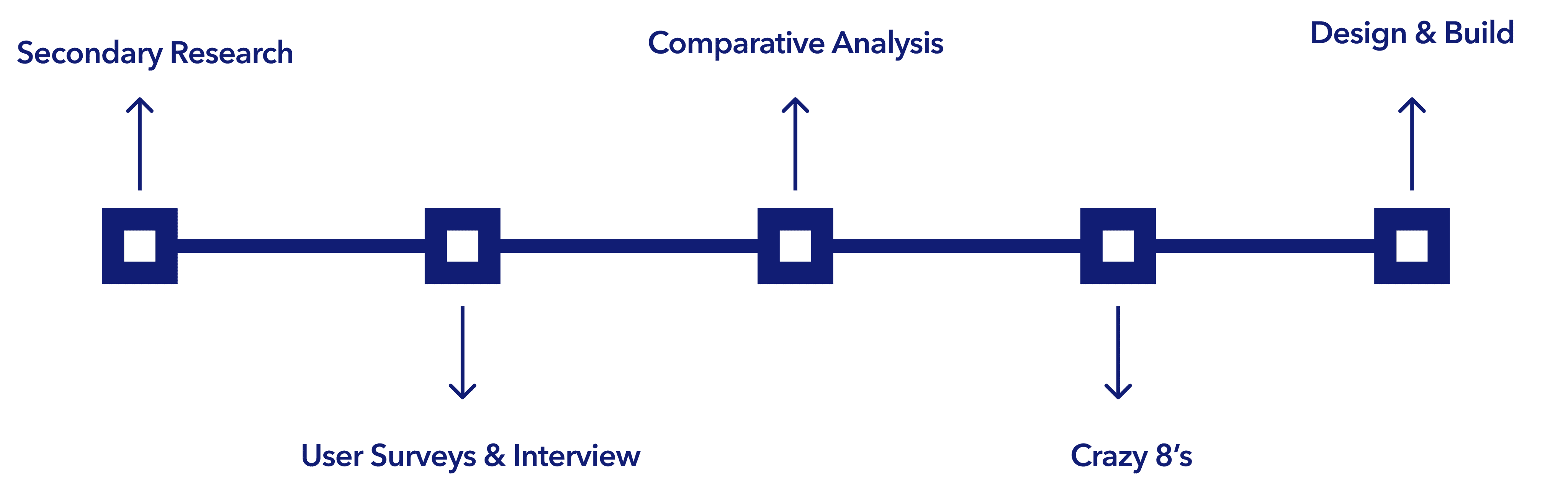
Our Process:
Collaborators
Role
• UX Research (user interview, persona, competitive
analysis, research, and user testing)
UX Design (wireframe, hi-fidelity prototype design)
Duration
September 2021 - December 2021
Team
John Kellejian
Daniel Meagher
Research:
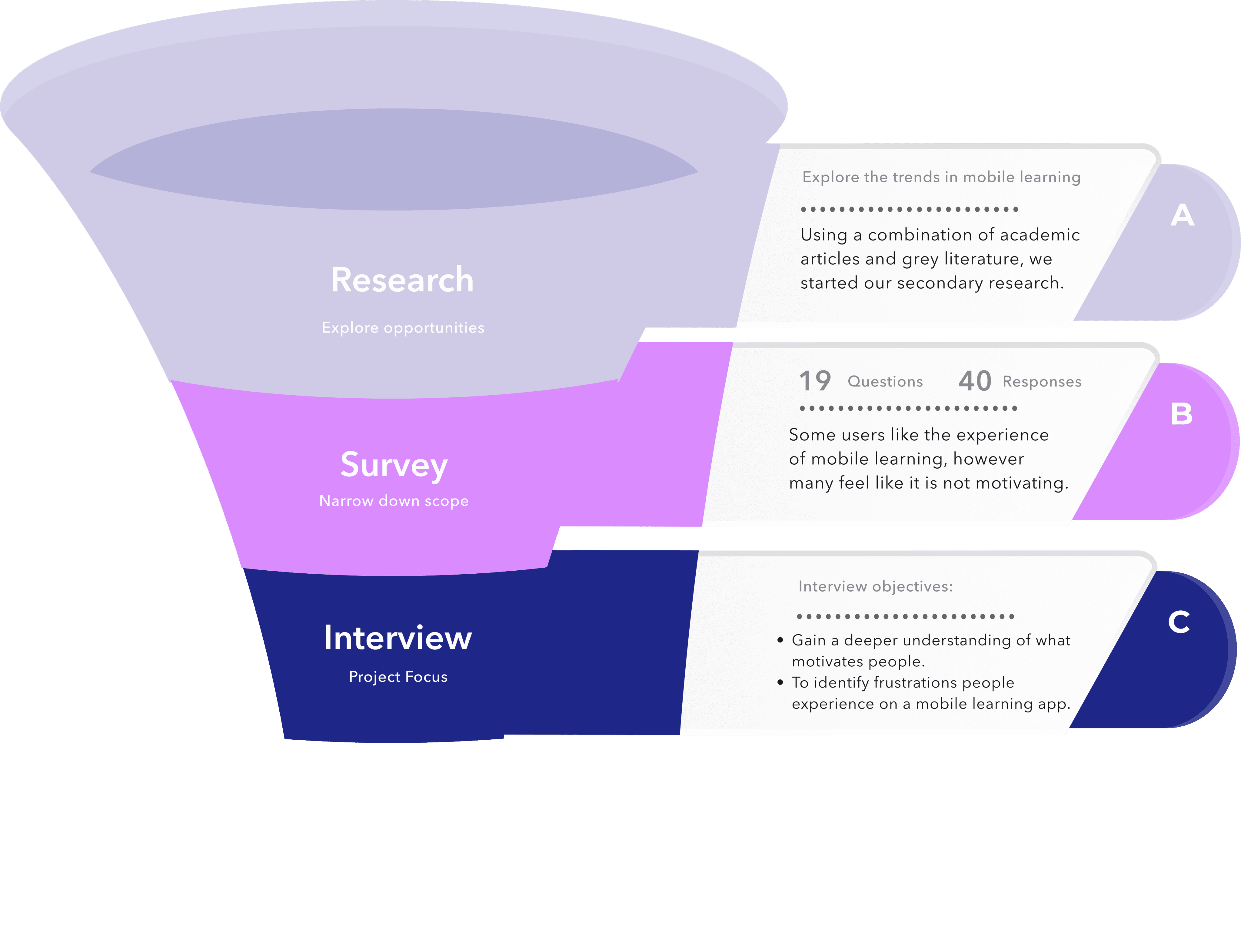
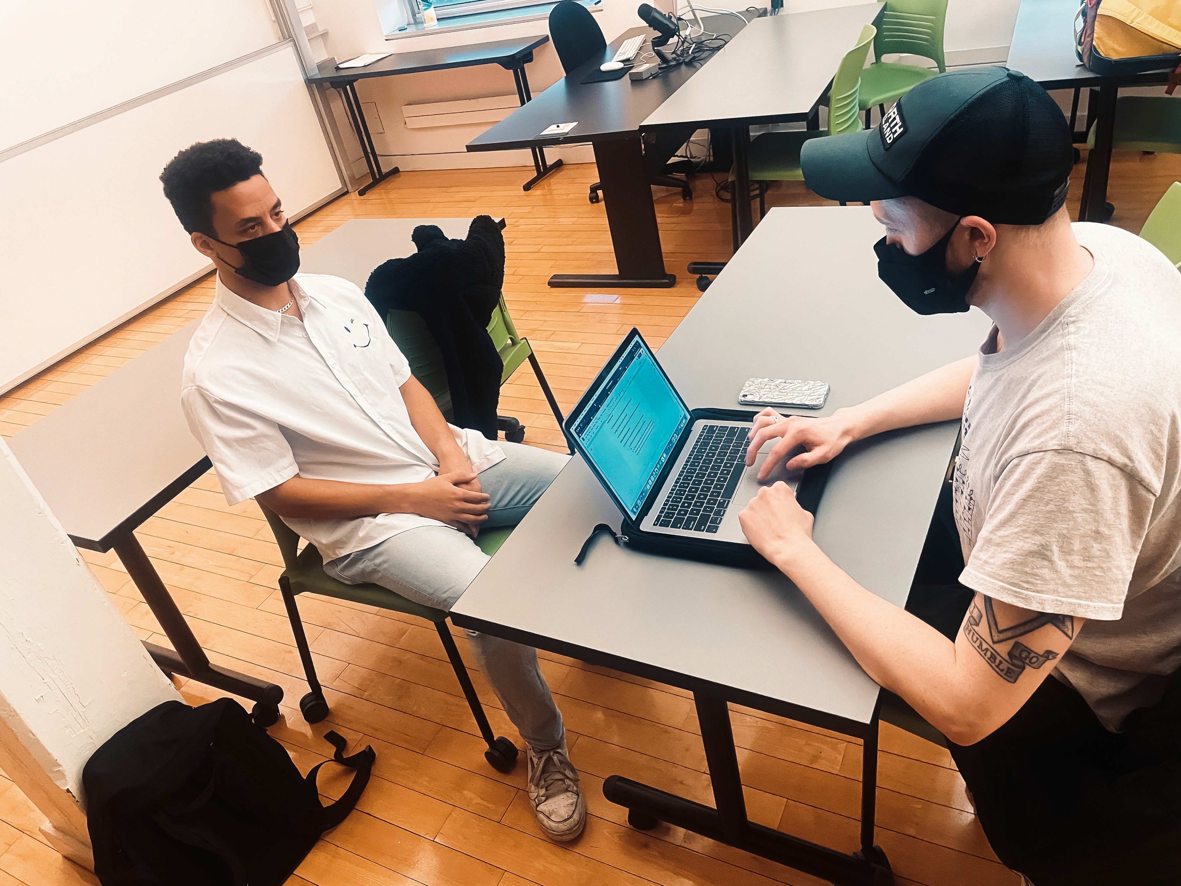
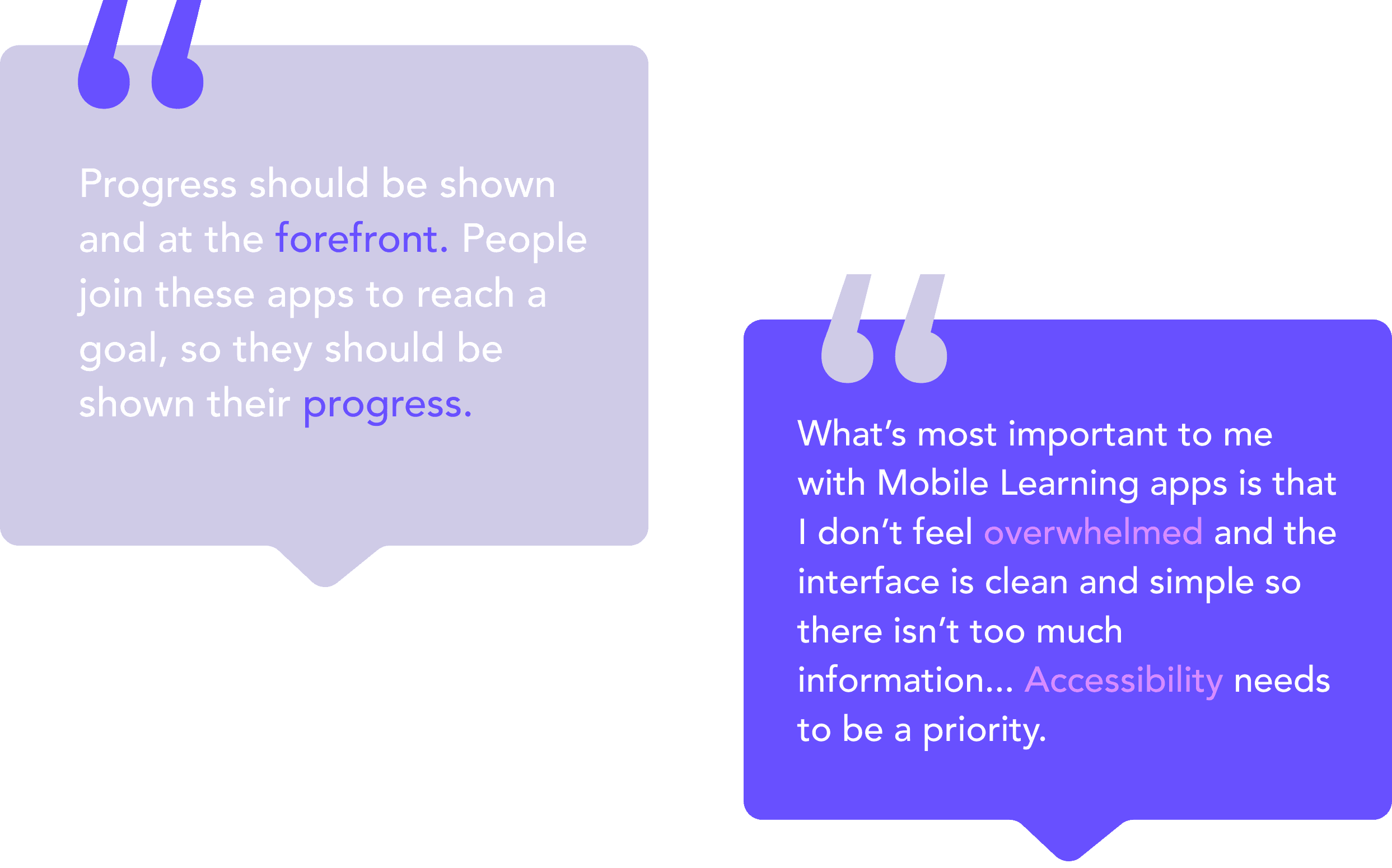
What People Said:
User Persona:
The Target Audience for Glimmer :
We created user personas from the interview data to design for our Gen Z target audience. From here, we could hone in on three common pain points throughout our interviews.
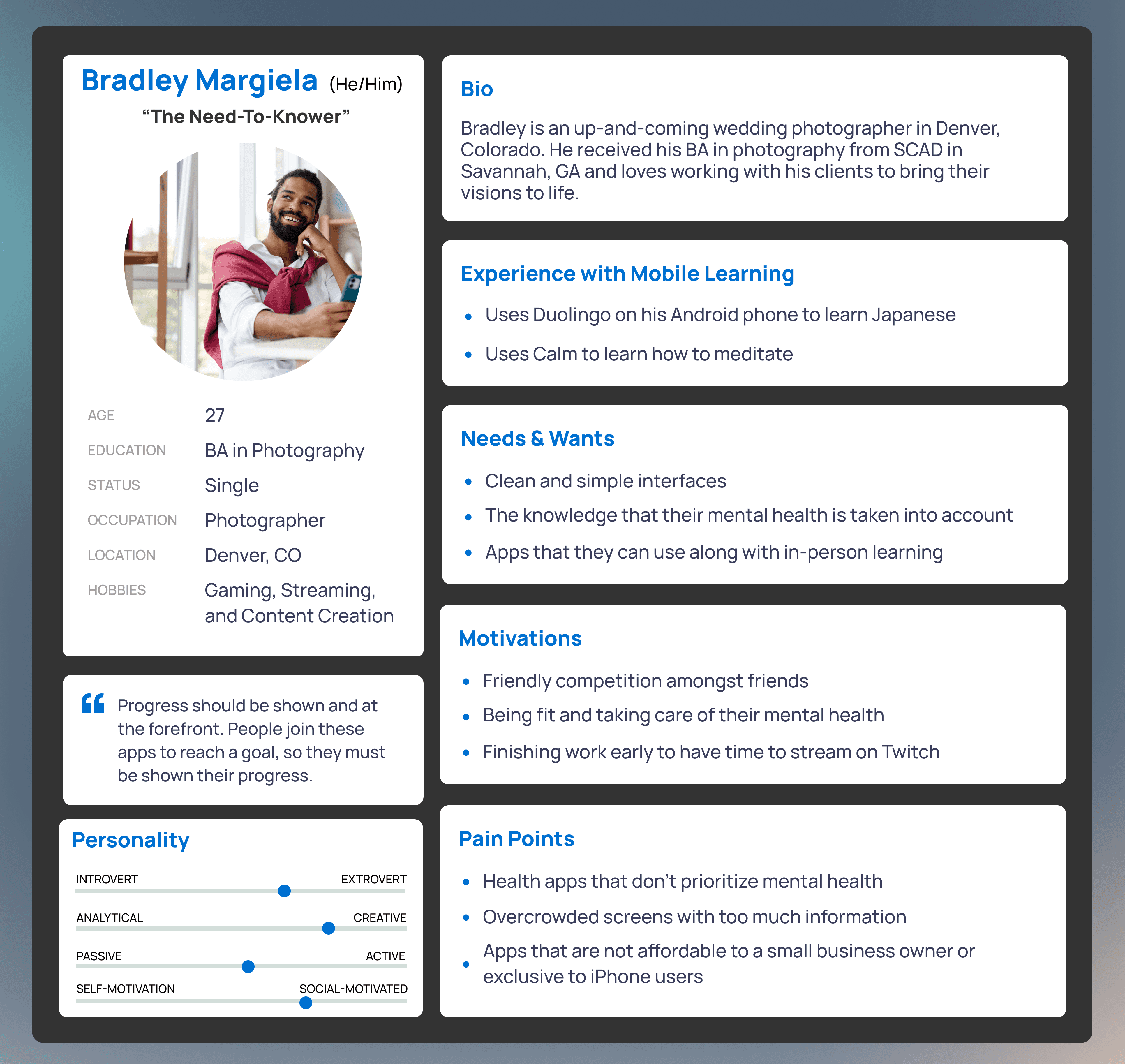
Pain Points:
• Health apps don’t prioritize mental health
• Overcrowded screens with too much info makes it challenging to stick with the app
• Mobile learning apps often don't provide enough feedback
Product & App Features:
• Simple and Easy onboarding --> Optimal for getting people started without bogging them down
• Mindfulness Practices --> Cultivate a sense of inner peace throughout the user’s daily life and give them tools to build a more mindful lifestyle
• Journaling feature --> Allows users to keep track of their mental health
• Foster a sense of belonging --> Recommend group meditation courses to encourage a sense of community
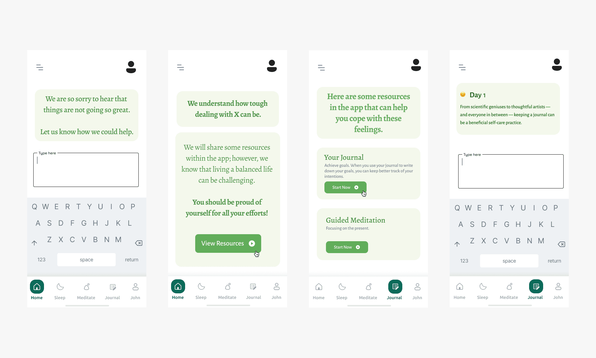
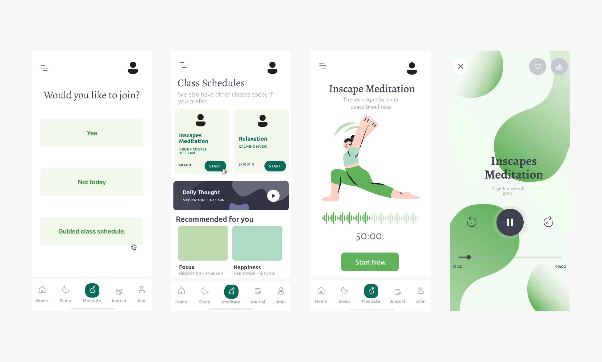
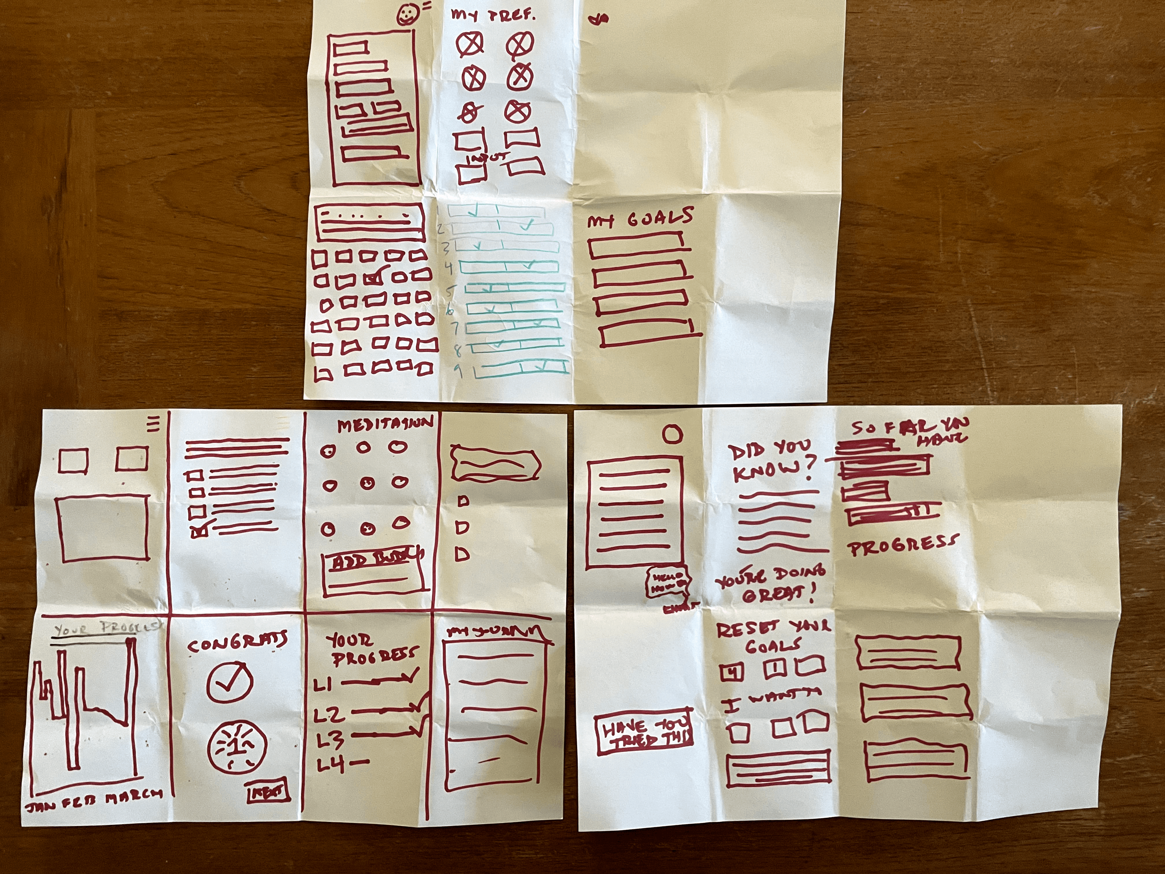
Based on the crazy 8 exercise, we designed our Mid-Fi wireframe. We used this to conduct a quick usability testing round before moving forward to the Hi-Fi stage.
Mid-fi Wireframes:
Scenarios
You are new to Glimmer; however, you want to learn about emotional health and how to better care for your mental health.
• Check-in with the app about how you are feeling today
• Check out the Guided Meditation classes
• Check out the full meditation class schedule
Participants
3 participants
Tasks
Moderated Usability Testing :
Ideations:
How can we make a health app focused on mindfulness that is fun, engaging, motivating, and will promote well-being for our users?
No body-shaming
mechanics in the app.
Prioritize
mental health
1
No unnecessary functionless
UI components.
Minamalist
design
2
Emotional check ins &
journaling features.
3
Provide resources
in the app
Motivate
people
4
Add badges & a buddy system to motivate continuous use.
Crazy 8
We used the crazy 8 method to brainstorm the possible solutions for these four design opportunities.
Key Takeaways:
• Two participants were confused by the lack of a back button on certain screens
Users were confused about what was different about the “meditate” icon on the bottom navigation and the “Guided class schedule” button
One participant said adding icons in the first task would better represent certain moods
Users were confused about where to find the meditation section in the third task (the button stating the guided class schedule was not clear)
Two participants said they found the layout of the home screen slightly confusing
Final Prototype:


Creating the Style Guide:
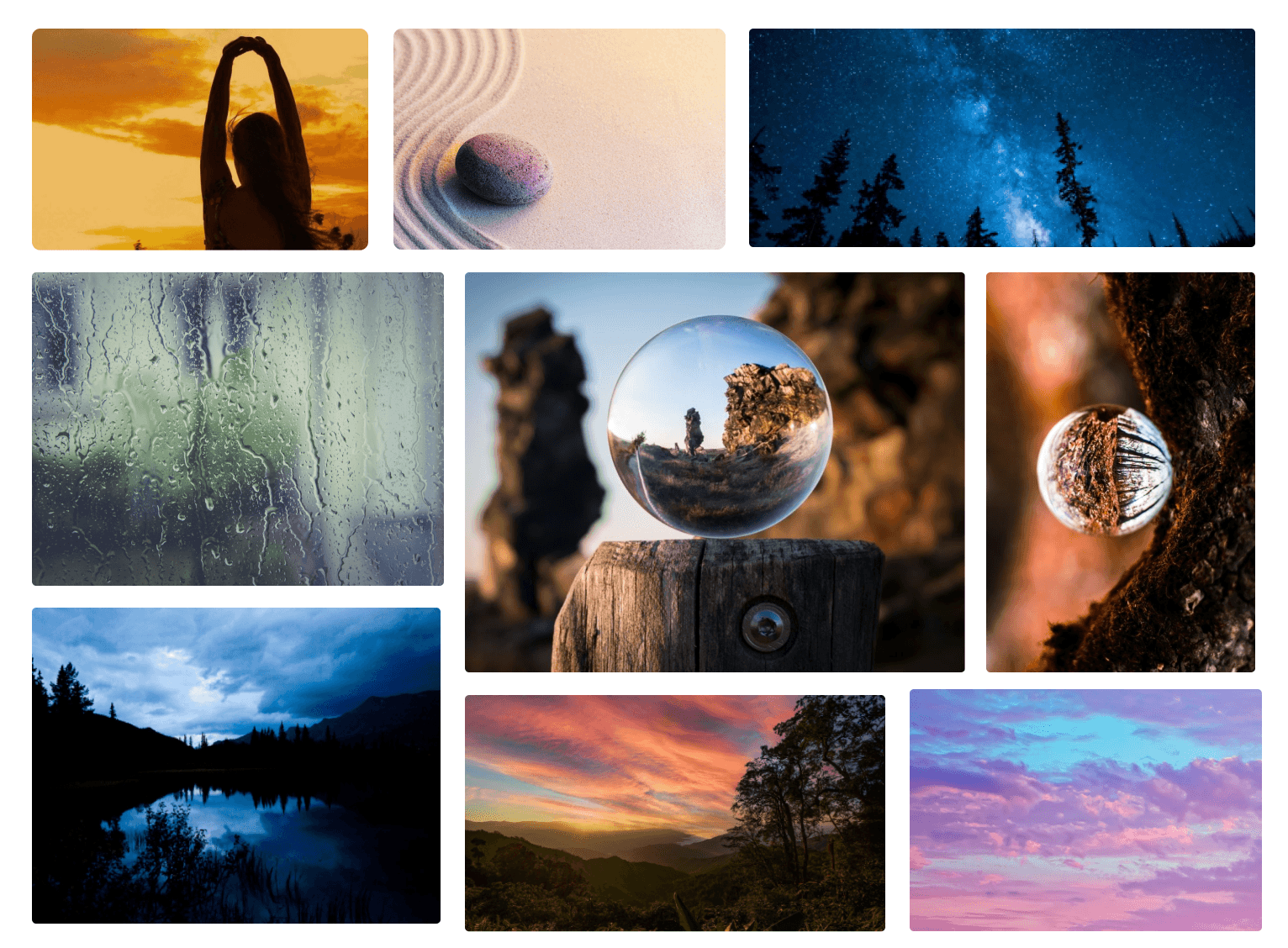
After we completed our testing sessions and received feedback from our users, the app was in an excellent place to incorporate images, and finalize a style guide.
The color palette offers a full range of colors that sets the brand’s identity and influence the visitors' psychology.
HEX: #00000
HEX: #979797
HEX: #121E74
HEX: #1E2788
HEX: #6850FF
HEX: #DA8CFF
HEX: #CFCBE7
Promotional Video:
We also created a promotional video of Glimmer to advertise the app to potential customers. Feel free to watch it below.
TYPE-SCALE (Minor third)
Typography
BODY COPY
Heading 1
Heading 2
Heading 3
Body Large - 16px
Regular
Body Small - 14px
Regular
Caption Large - 12px
Regular
Caption Small - 11px
Regular
Footer - 10px
Regular
Footer - 10px
Semi Bold
FOOTER - 10px
SEMI BOLD CAP
Caption Small - 11px
Semi Bold
CAPTION LARGE - 11PX
SEMI BOLD CAP
Caption Large - 12px
Semi Bold
CAPTION LARGE - 12PX
SEMI BOLD CAP
Body Small - 14px
Semi Bold
Body Large - 16px
Semi Bold
Heading 4
Heading 5
Heading 6
Paragraph (Large) 16px
Lorem ipsum dolor sit amet, consectetur adipiscing elit, sed do eiusmod tempor incididunt ut labore et dolore magna aliqua.
Paragraph (Medium) 14px
Lorem ipsum dolor sit amet, consectetur adipiscing elit, sed do eiusmod tempor incididunt ut labore et dolore magna aliqua.
Paragraph (Small) 13px
Lorem ipsum dolor sit amet, consectetur adipiscing elit, sed do eiusmod tempor incididunt ut labore et dolore magna aliqua.
HEADINGS
BODY
20px
24px
28px
32px
40px
48px
Graphik | GRAPHIK - (Thin)
Graphik | GRAPHIK - (Light)
Graphik | GRAPHIK - (Medium)
Graphik | GRAPHIK - (Semi-bold)
Graphik | GRAPHIK - (Bold)
(Sans-serif)
(Serif)
Fraunces - (Regular)
Fraunces - (Semi-Bold)
Fraunces - (Semi-Bold)
Graphik is the primary typeface. Text style and size is critical. Maintain minimum contrast ratios for foreground text and background colors for high readability and contrast.
Fraunces is the secondary typeface. Text style and size is critical. Maintain minimum contrast ratios for foreground text and background colors for high readability and contrast.
Bottom nav bar
Home
Sleep
Journal
Me