The Met
Evaluating and Enhancing the Mobile Collections Experience
Overview & Goals:
To explore user engagement with its website on desktop and mobile platforms, The Metropolitan Museum of Art collaborated with The School of Information at Pratt Institute to allow graduate students to explore solutions. My group and I decided to focus on the mobile user experience on the collections page.
During the early research phase, it became apparent that the Collections page was experiencing increased mobile user traffic. Thus, we came up with two high-level goals: firstly, to identify potential usability issues and interaction patterns of mobile users; secondly, to determine what content to highlight on the mobile Collections page as well as how to most effectively design a mobile-friendly experience that is optimized for natural eye movements.
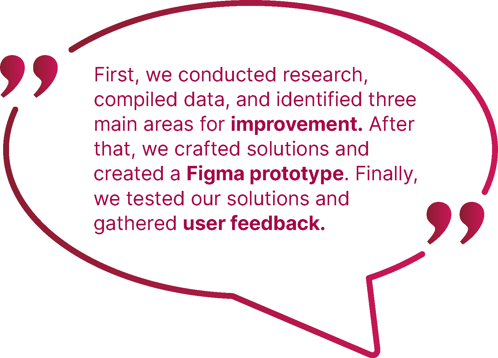
We used various tools, including Figma, Tobii-pro Eye-tracking technology, Google Analytics, Dovetail, and Hotjar, to achieve our goal and give a final report on May 3rd, 2023, to the Met's team of designers and researchers, where we received positive feedback on our solution.
Collaborators:
My Role
• UX Research (user interview, eye tracking facilitator,
note taker, and user testing)
UX Design (wireframe, hi-fidelity prototype design)
Duration
Feb 1st - May 3rd, 2023
Team
Nishi Chitale
John Kellejian
Shivani Kolte
Lillian Yang

Our Process:
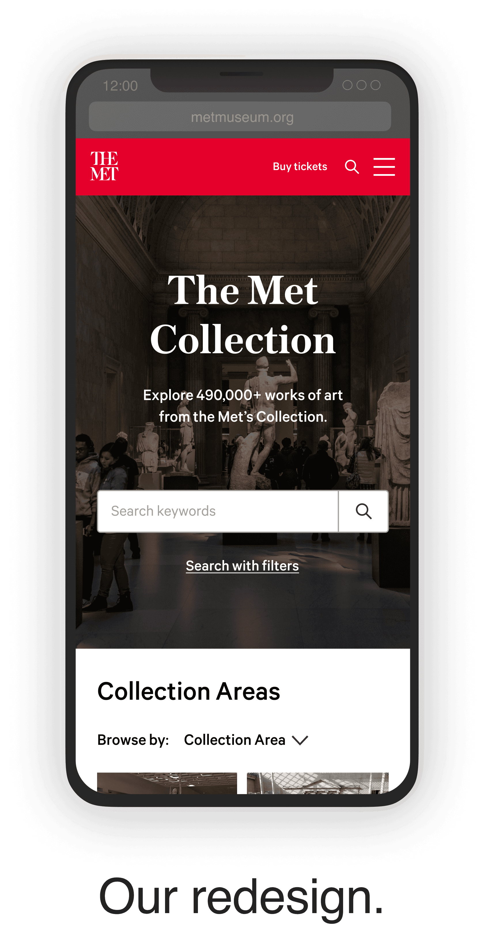
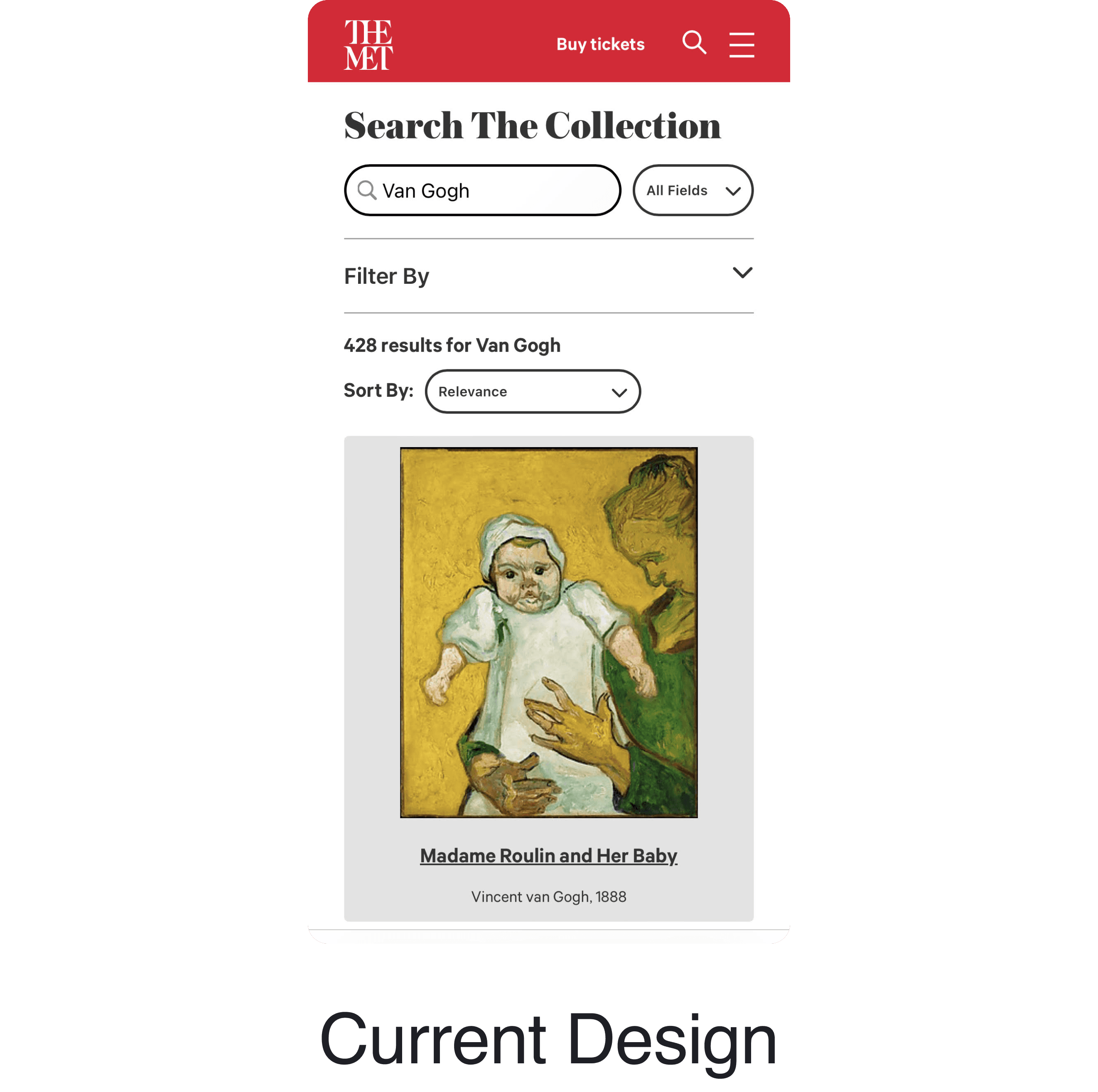
Isolated search page
Another significant change is integrating an isolated search page into the browsing experience. Therefore, when users click on the search bar, they will be directed to this search page instead of merely zooming in on it.
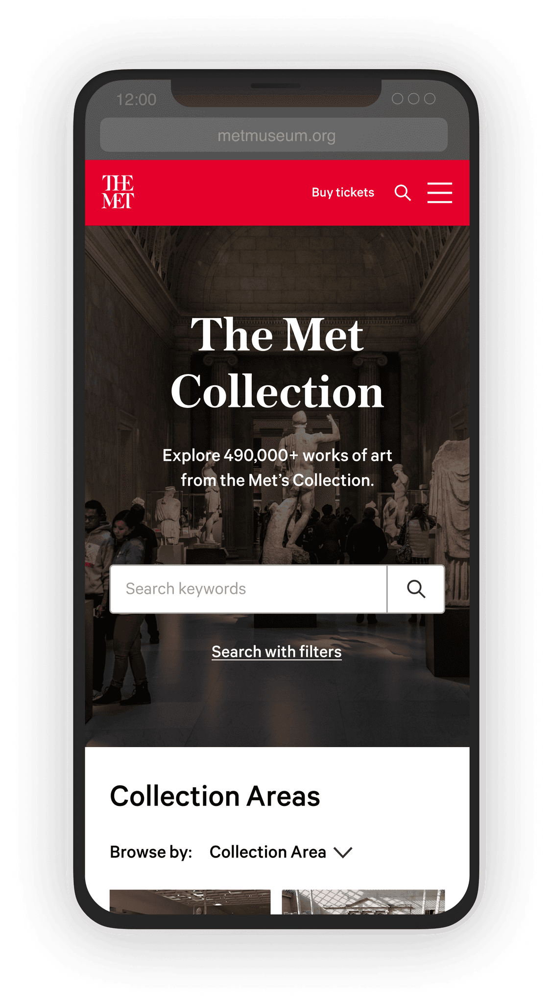
Minimal search start page
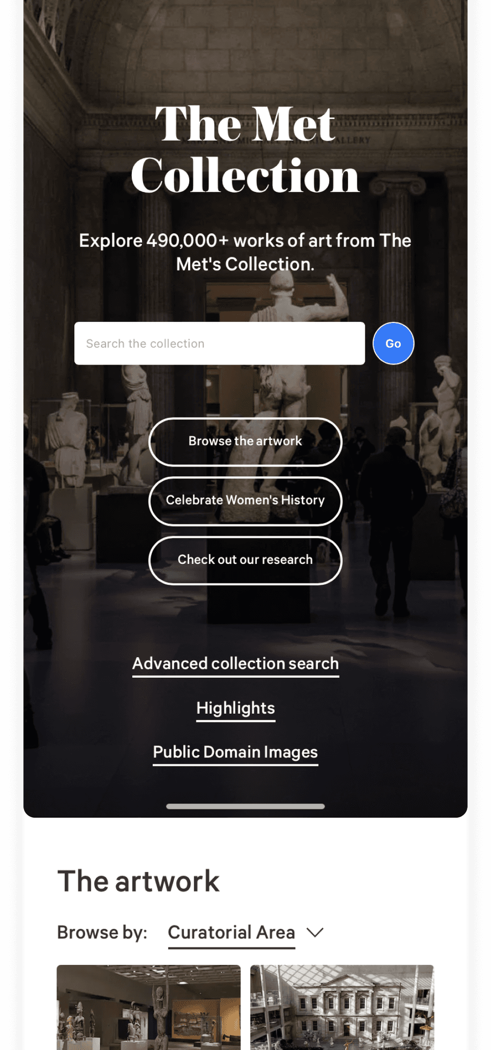
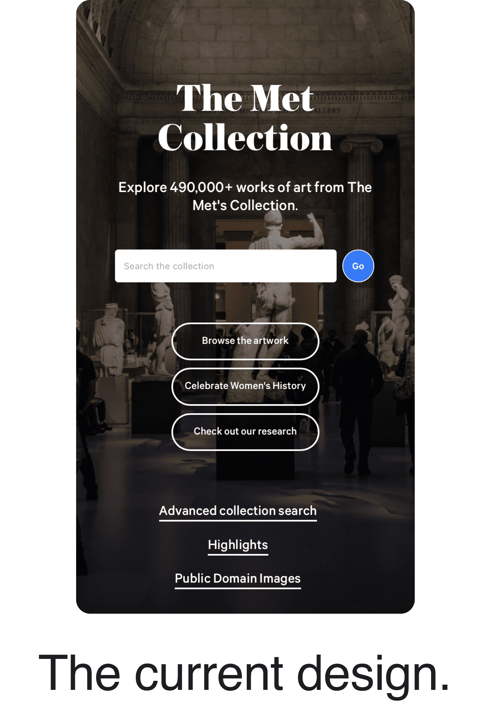
The first significant change is that only the necessary button remains in the top banner area.
This change alleviates the visual clutter of the top area, and the users can now see the "Collection Areas" list without having to scroll down on their mobile devices.
Keyword suggestion with typo tolerance
The isolated search page has the added benefit of supporting an auto-completion feature that displays thumbnails and keywords to assist non-expert users.
We also recommend implementing increased typo tolerance allowing the search feature to be more forgiving of user errors, resulting in a smoother and more intuitive user experience.
Our Changes:
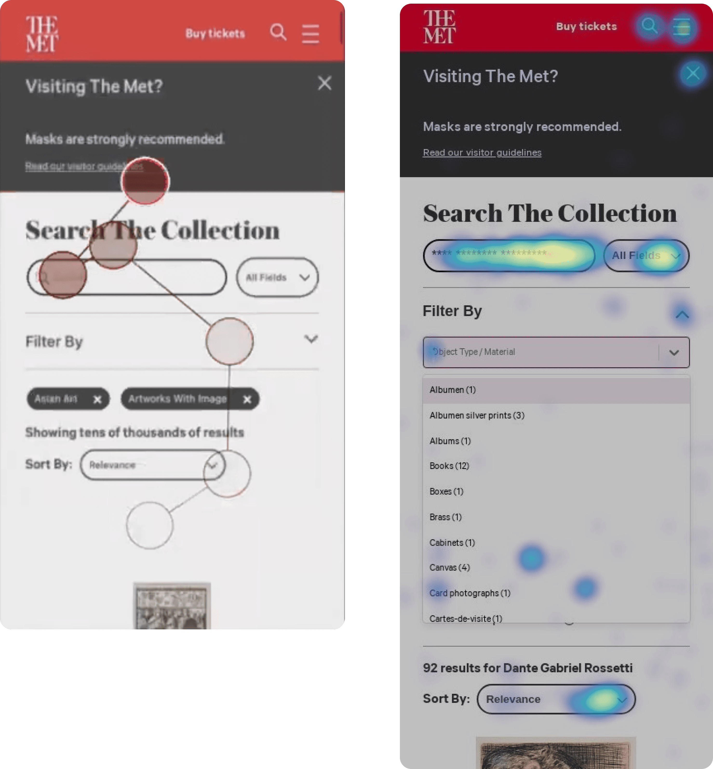
Unnatural zoom-in effect
We found a problem with the search bar's functionality. As shown in the video example on the right, when the keyboard pops up, it zooms into the screen, which hinders our users' seamless interaction. One of our participants mistook the links below as the search button during their test, and this caused them to not trust the search function during the rest of their tasks.
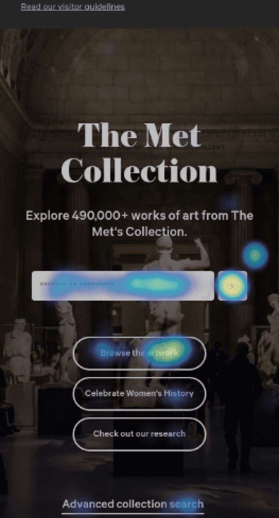
The ‘Go’ button is too small and the label isn’t clear.
The "GO" button is too small. This heat map shows that the area above the button is where our participants would mis-click the "GO" button.
Also, the "Go" button should be clearer as one of our international users failed to recognize it as the search button. Consequently, they mistook the jump link "Browse the artwork" as the search button, leading them to distrust the search function, stating, "I can't trust this search function anymore.".
Jump links are unhelpful and easily ignored
One interesting behavior we found from our users was that they rely on ‘high-level categories’ to narrow down their search.
Thus, these collection areas titled "The Artwork" significantly helped the search experience of our art-history-beginner users. However, the problem is that it was hidden below the jump links and hero image. So the users had to scroll down to even learn they existed.
We also noticed an issue with the jump links in the banner, as they appeared similar to the call-to-action (CTA) buttons on this page.
Searching Experience:
Redesigning the Search Experience:
User Feedback:

Participant 1
“There was too much going on there, so I skipped the Collection Areas before. But now it’s clearer.”

Participant 2
“The interaction feels much smoother and easier. I feel confident in searching."

Participant 3
"Yes, this is a much cleaner design. I am able to easily focus on the task at hand now."
Low discoverability of the filters
Another major usability issue we found was the poor discoverability of the filters. Our users were confused between the 'All Fields' and 'Filters' options and unfamiliar with the accordion pattern used for advanced filters. One of our participants said: "My brain just skipped the 'filter by' part.".
Based on data from Hotjar regarding 654 sessions on mobile:
• 6.26% of the visitors tap on the ‘All Fields’ button
• Only 0.08% of the visitors click on advanced filters
• 5.6% of the visitors click on ‘Sort By’
• 8.7% of the visitors use the pagination
• 50% of the users do not scroll past the first 4th result
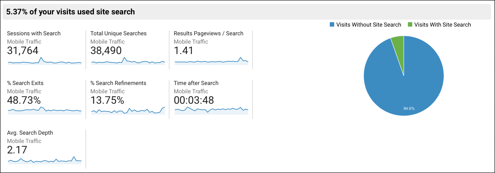
Low discoverability of the filters (cont)
We also cross-referenced this with the Google Analytics data for mobile search on the Collections page, which indicated comparably low engagement rates. Very few users used the Collections search and those who did exit quickly afterward.
Based on data from GA Mar 27 - Apr 23 for the last 30 days for mobile:
• 5.37% of the users used the Collections search
• 48.73% of users left the website immediately after searching
• 2.17 pages is the avg. search depth
Negative user perception of endless scroll
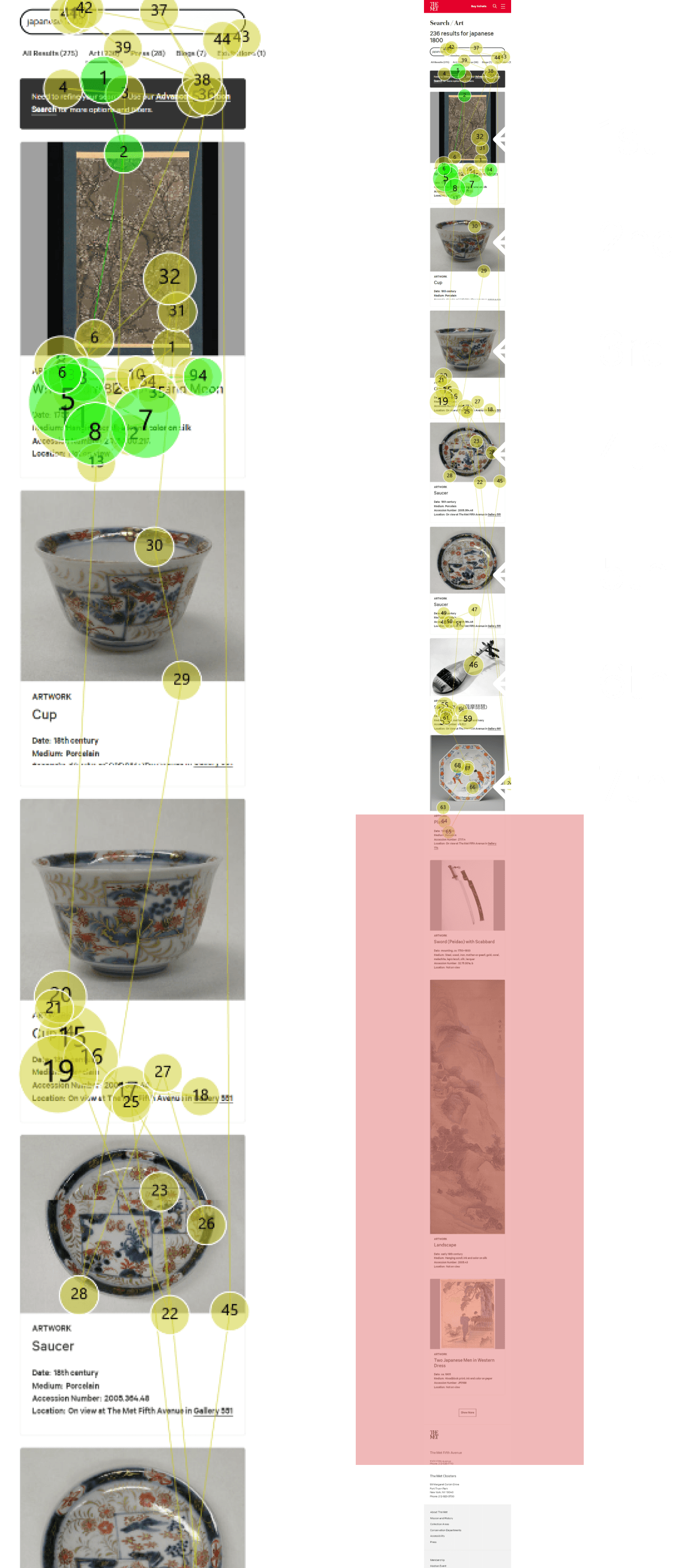
We discovered that users found the pictures visually appealing, yet, the Tobii Heatmap analysis revealed that users mostly scanned through the top results and spent little time viewing the images.
Furthermore, our observations showed that the page's endless scroll feature was causing users to disengage with the content.
The lengthy results page led users to scroll quickly and only pause at items that caught their attention. Users would ignore the content after the sixth or seventh result.
Listing Experience:
New Pagination & Filters:
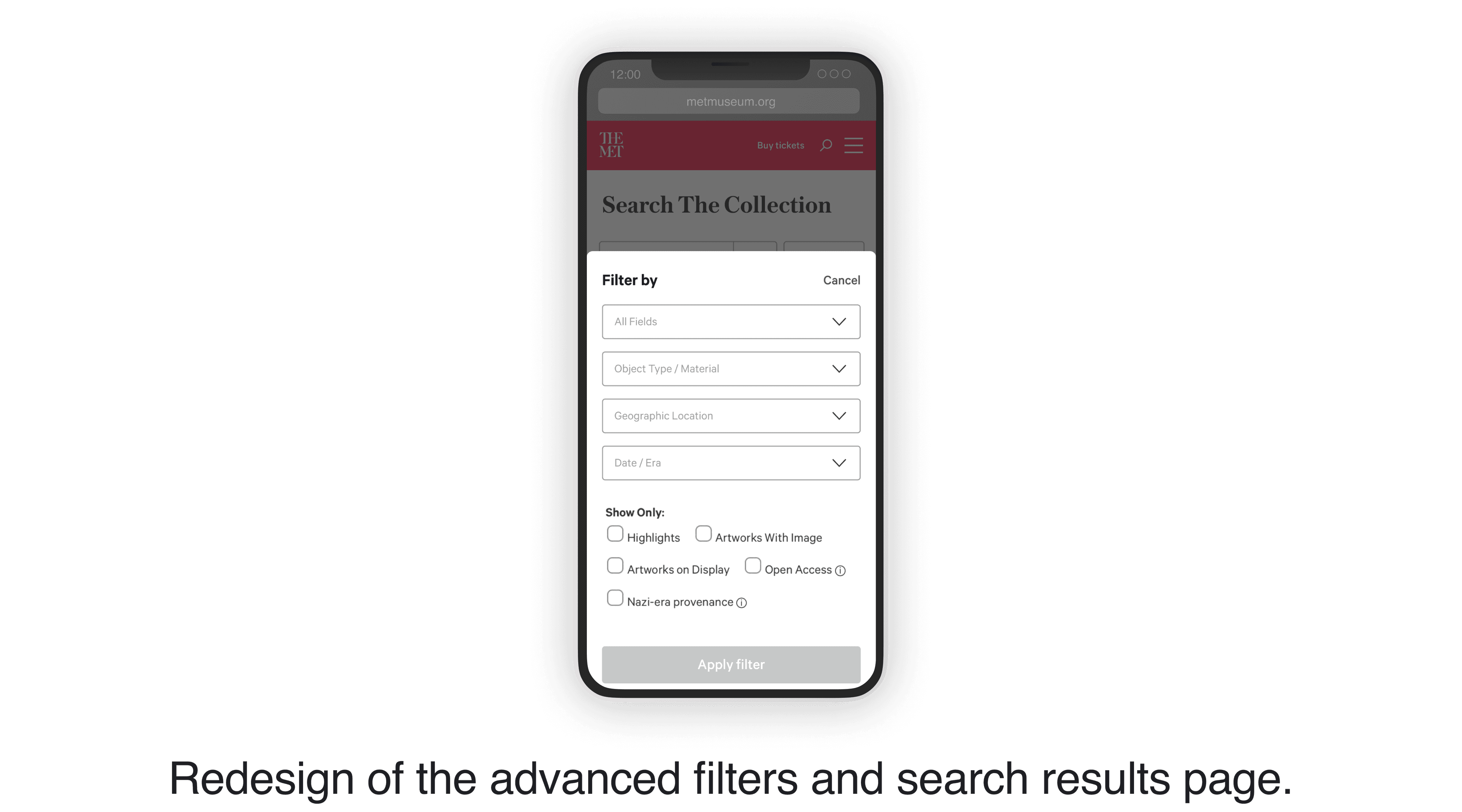
Simplified search bar and upfront access to filters
We streamlined the search experience by simplifying the interface and making it more intuitive.
Users can now access the filters through a dedicated bottom sheet by turning the filters into a clickable button.
We also standardized sizes for all preview images and limited results to 8 objects per page.
Our Changes:
Insight Summary:
• Jump links are distracting and unhelpful
• Sudden zoom causing usability issue
• Poor error prevention for new users

Search Results and
Filters
• The infinite scrolling feature is leading to user frustration.
• Low discoverability and use of filters
Object Details
Users do not prefer long descriptions
Ensure that the accordions are in a closed state by default
User Feedback:

Participant 1
“I wasn’t able to understand the ‘all fields’ box beside the search. This is definitely better, I get that it’s filters now.”

Participant 2
"Previously, I avoided using the search filters, but now they're helpful and a lot easier to use."
Quick skims of text content
Participants in our study tended to focus more on the first and last sentences of text content rather than reading it word by word.
As the content became longer, participants reported feeling overwhelmed by the amount of information presented.
In this video, you can see how they seem lost within several accordions opened simultaneously.
Object Details:
Our Suggestions:
Close accordions by default and place them on the upper part of the page
To compare, we showed our participants an exemplary page. Our users said that the description length was suitable, and the grouping of accordions and having them closed by default made it easier for the users to navigate the content.
Participant Recruitment:
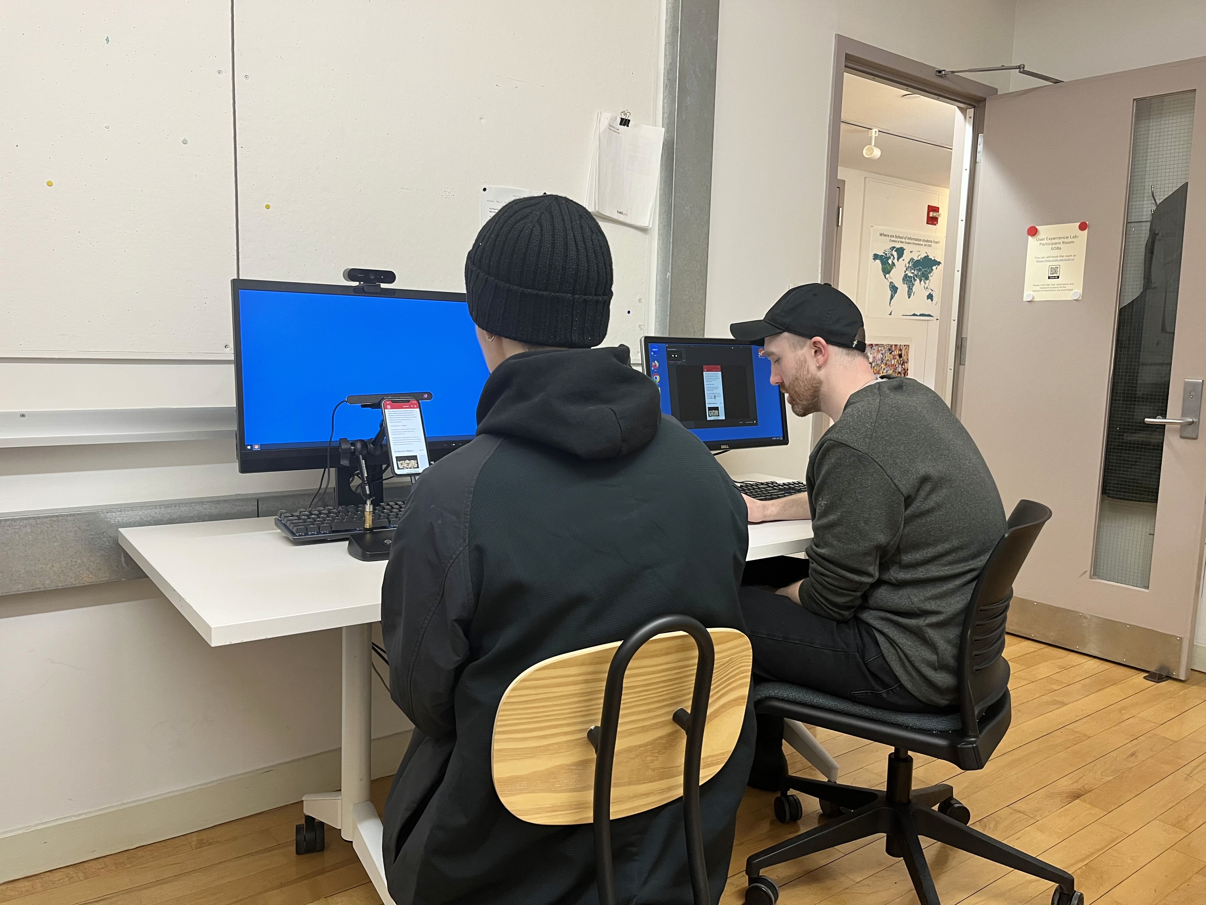
We recruited eight participants who reflected our user characteristics. Our participants' age group was between 20 to 30, with the majority having a basic or intermediate understanding of art history.
We used Tobbi pro nano to conduct eye-tracking tests to examine users' interaction with the Collections page by assigning various tasks to them. After completing the tasks, we asked participants five post-task questions and administered a system usability scale to gauge overall user experience. Following the eye tracking test, we also allotted time for a retrospective think-aloud to ensure accurate and thorough feedback.
SUS Score Result:
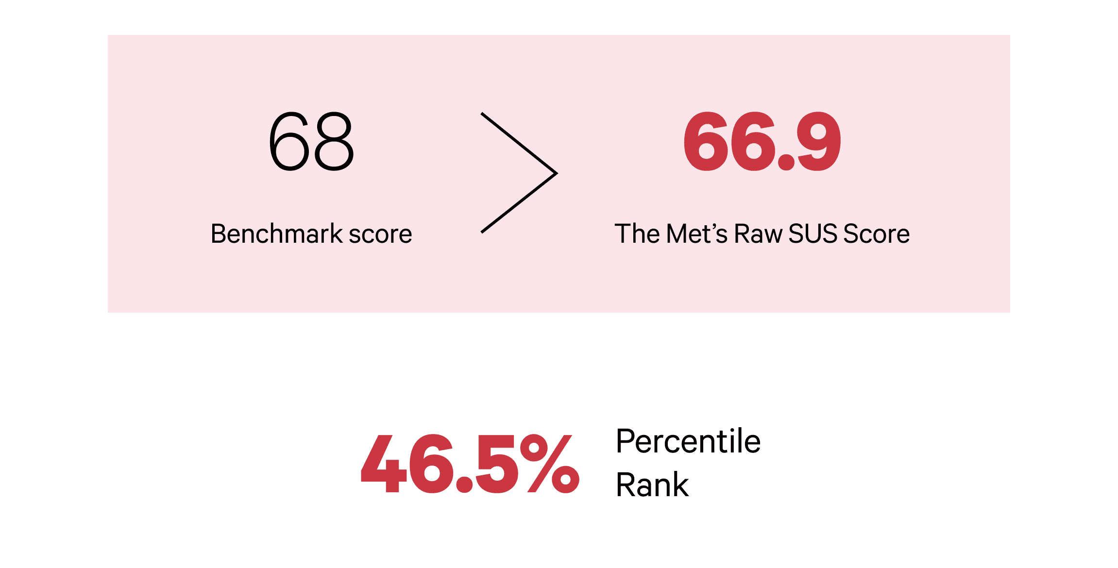
The SUS score result had a slightly below-average score of 66.9. In comparison, our colleagues researching the desktop Collections obtained a SUS score of 86%, which was significantly higher.
This analysis made it clear that the mobile Collections page needed improvement.
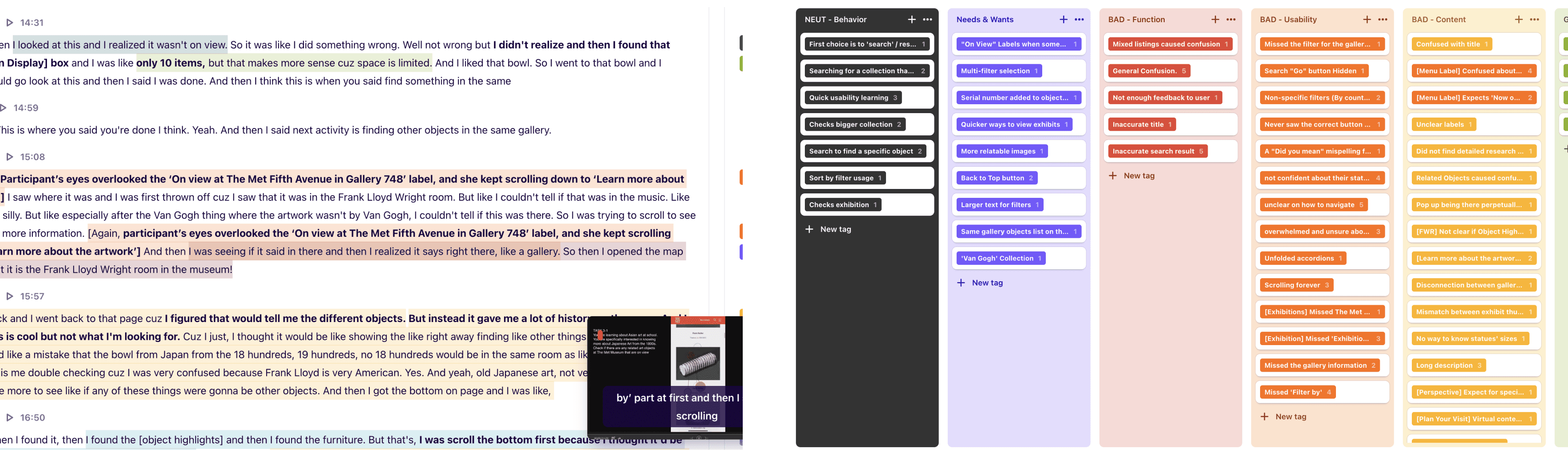
Qualitative Data Analysis:
Our recordings and data were collected into Dovetail, where we analyzed and gained insight into user preferences, pain points, and overall user experience. We found 60 major and minor issues, which we identified and classified into three categories: 'Usability', 'Content', and 'Functionality'. Diving deeper into our eye-tracking data, our team also looked at Heat maps, Fixation Points, and Gaze plots to gather more data on what visitors use on the mobile site.
Outcomes:
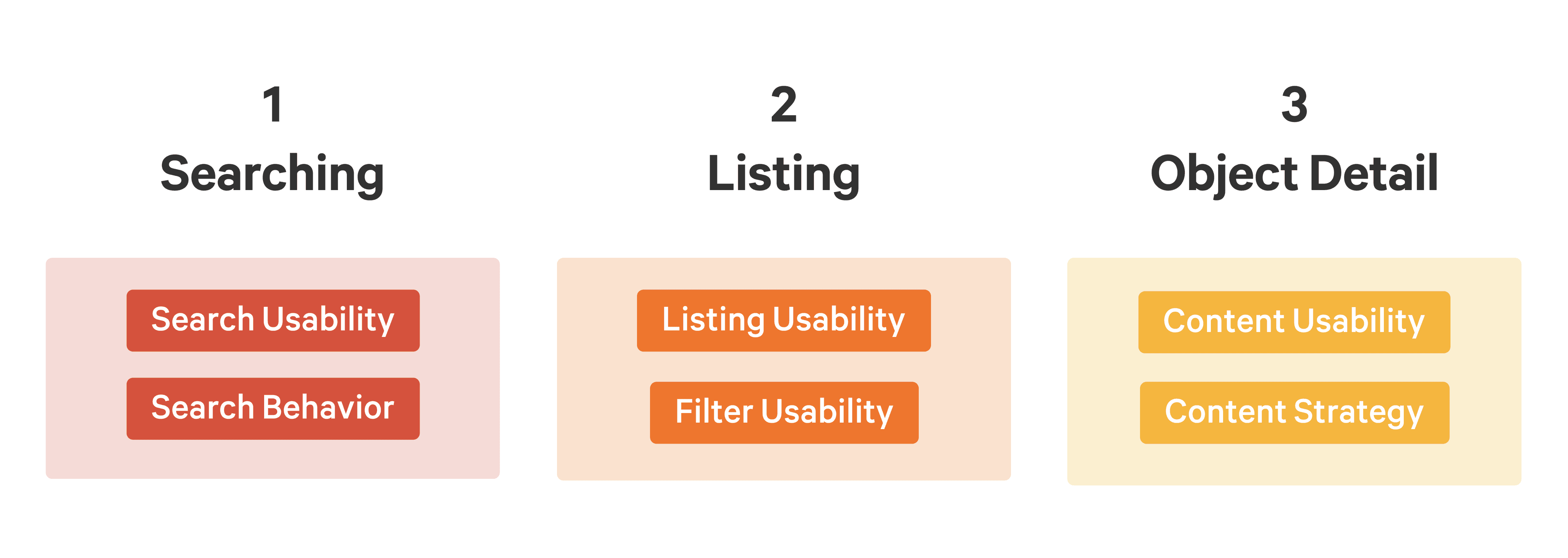
By meticulously analyzing our research findings, we identified three major themes: Searching, Listing, and Object Detail.
Conclusion: